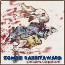
 Even though they were only middle school kids why can't they have pointy teeth and claws? Will they get nightmares? I personally think a dull tooth would hurt much more than a sharp tooth. Sharp teeth will penetrate with less surface tension than dull teeth. A dull tooth may require 10 times the clamping pressure to finally puncture and tear the skin. Also razor-sharp cuts don't leave nasty scars.
For that matter, what's with the 20MPH zone in front of schools? If I drive over a kid at 20MPH it will only drag out the crunching pain and torture even longer. Why not go fast and get it over with? And there's also the possibility the kid could even be knocked clear of the car's tire path. See? (joking)


Lucky kids to get such a cool mascot. You even gave it the full four fingers instead of the traditional three for this type of cartoon character! Bravo! -- Mykal
ReplyDeleteI'm still laughing Keith about your brilliant car-traveling-at-20mph-pedestrian-smashing scenario!!!! And yeah, even with these "mods" your mascot is supremo-neato. I wish my school had had one like this. When I win the lottery, I'm setting up a Comics Company to be run/and illustrated by Mykal & you (respectivley) best,
ReplyDeleter/e
Thanks Mykal and R/E! I think they asked for the proper number of toes. It's coming back to me now. I believe he originally had 3. Yes the 20MPH thing is logically unsound and dangerous to children!
ReplyDeleteif you still have it, post your original design.
ReplyDeletei can certainly understand your frustration but at least your final still turned out looking great. if i were in middle school i would think it is a bit too cute for my tastes, but that ain't your fault!
ReplyDeleteSalad Shooter, Thanks for the comment, I did this with ink so all my changes were made with White-Out(tm) and redrawing over the top. The original version is buried under all that.
ReplyDeleteBrad, thanks! Me too.