
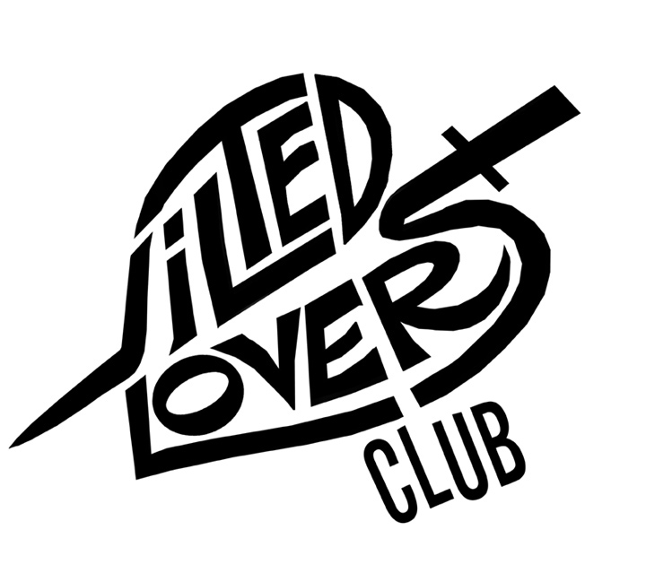
Here was the runner up design. The letters form a heart with a dagger through it.
HERE is a link to their website, and you can hear two songs they wrote and recorded. The lead singer is very sweet and her dad is an animator, so that makes her extra cool.

they are both cool, but i prefer the runner-up with its Stereofedelic style.
ReplyDeleteMe too! They both are good enough to make you a wealthy man KW.... if anybody has the talent (art, et al) to quit his 'day job' and just become a pro-creator (animation, comics, art, music, logos) IT'S YOU!
ReplyDeleteBoth are good, but I give the slight "nod" to the first one
Thanks guys for the kind words!
ReplyDeleteHi KW
ReplyDeleteThanks for posting Nikki's website, and for the kind words!
I like the second one as well, but I've seen the first a lot recently and it really looks great everywhere.
Free trade seems to be working, "EH?"
Well done!
thanks Willy, and no problem!
ReplyDeleteVery Nice Blog...
ReplyDeleteAwesome!! Very inspiring, this is going to be my dose of creativity for today, I liked them all, especially first one.
ReplyDeleteLogo Designs