
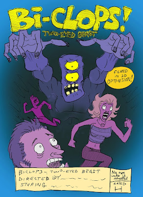
This is a rough pencil sketch I scanned and quickly colored in a photo-manipulatin' program. These colors are all on different layers so I can alter the HUE, SATURATION, and BRIGHTNESS with the slider tools until find a set of colors I'm happy with.
I guess most people may already know this, but if anyone doesn't:
When I have each color on a separate layer, I can start by making everything the same color. Or I don't have to. It doesn't really matter which color I start with since they all get manipulated anyway. With those 3 sliders you can get literally any color in the world.

I guess most people may already know this, but if anyone doesn't:
HUE = which color. Red, orange, yellow, green, blue, or purple?
SATURATION = the range between gray-scale and full color
BRIGHTNESS = how dark or light
When I have each color on a separate layer, I can start by making everything the same color. Or I don't have to. It doesn't really matter which color I start with since they all get manipulated anyway. With those 3 sliders you can get literally any color in the world.
When I do the actual painting I know my paints won't be able to exactly immitate the glowingly radiant brightness of computer monitor colors, but it gets me going in the right direction. It takes out all the guess work and mistake cover-upping.
You can rarely go wrong by intentionally altering colors in an unnatural way to achieve a color scheme. Even though skin isn't purple in real life it looks better being purple for this particular color scheme. There's some deeper color scheme info HERE.


No comments:
Post a Comment