
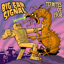
This character is called Smedial. He's supposed to be simple, friendly and inviting, and easy to recognize from a distance.


I like symmetrical things. The S in this logo mirrors around the M to form an L. I think a logo should look like it could easily go on a superhero's chest. That's my ultimate personal criteria.

I found this list of 45 rules for making logos on the internet. Although 11 and 31 seem the same to me, it's still a good list and the information is pretty handy:
1. Do not use more than three colors.2. Get rid of everything that is not absolutely necessary.3. Type must be easy enough for your grandma to read.4. The logo must be recognizable.5. Create a unique shape or layout for the logo.6. Completely ignore what your parents and/or spouse think about the design.7. Confirm that the logo looks appealing to more than just three (3) individuals.8. Do not combine elements from popular logos and claim it as original work.9. Do not use clipart under any circumstances.10. The logo should look good in black and white.11. Make sure that the logo is recognizable when inverted.12. Make sure that the logo is recognizable when resized.13. If the logo contains an icon or symbol, as well as text, place each so that they complement one another.14. Avoid recent logo design trends. Instead, make the logo look timeless.15. Do not use special effects (including, but not limited to: gradients, drop shadows, reflections, and light bursts).16. Fit the logo into a square layout if possible, avoid obscure layouts.17. Avoid intricate details.18. Consider the different places and ways that the logo will be presented.19. Invoke feelings of being bold and confident, never dull and weak.20. Realize that you will not create a perfect logo.21. Use sharp lines for sharp businesses, smooth lines for smooth businesses.22. The logo must have some connection to what it is representing.23. A photo does not make a logo.24. You must surprise customers with presentation.25. Do not use more than two fonts.26. Each element of the logo needs to be aligned. Left, center, right, top, or bottom.27. The logo should look solid, with no trailing elements.28. Know who is going to be looking at the logo before you think of ideas for it.29. Always choose function over innovation.30. If the brand name is memorable, the brand name should be the logo.31. The logo should be recognizable when mirrored.32. Even large companies need small logos.33. Everyone should like the logo design, not just the business that will use it.34. Create variations. The more variations, the more likely you are to get it right.35. The logo must look consistent across multiple platforms.36. The logo must be easy to describe.37. Do not use taglines in the logo.38. Sketch out ideas using paper and pencil before working on a computer.39. Keep the design simple.40. Do not use any “swoosh” or “globe”symbols.41. The logo should not be distracting.42. It should be honest in its representation.43. The logo should be balanced visually.44. Avoid bright, neon colors and dark, dull colors.45. The logo must not break any of the above rules.
Maybe trying to follow each and every rule would stifle creativity but it's nice to have these rules in the back of your mind when you make a logo. I guess the more of these rules you can check off the better off you'll be. That being said I've seen some pretty famous logos which don't really follow any of these rules. Maybe the product itself needs to be good before the logo will catch on.


Really dig your 45 rules; you might be able to consolidate a few of them to whittle it down to 30 rules... Several of your rules align with my own rule list for writing~! (keep it timeless, avoid trends, fo'get about friends & family etc.)
ReplyDeleteI wonder how many of these rules align with being a Samurai ?
The logo & character are excellent, by the way. You know, KW, your work is so good you now have to live up to yourself~! (like movie sequels)
'It's a dirty job, but someone's gotta do it~!'
Great, great logo! Simple. symbolic in nature - and I agree, great logos are always symmetrical, like bricks stacked together in perfect balance. Your logo reminds me of the Green Lantern's logo in it's simple design (not imitative, though). That logo's gonna look just great on letterhead. -- Mykal
ReplyDeleteKW: With regard to famous logos, check out Land O Lakes New Logo!! It does follow the rules. -- Mykal
ReplyDeleteWell done!
ReplyDeleteI love it!
Thanks for the logo info (hokey smokes, thatsa lotta rules! Good uns, tho!)
Mykal: stay away from Margarine, and the Squaws who peddle it. Both will kill you dead~!
ReplyDeleteLysdexicuss, Haha! I've seen that Samurai list and it's basically the same except for a few lines about eating humans for power.
ReplyDeleteMykal,
Thanks! Hey, I looked at the new logo and I think I like the old one best. Maybe it's just nostalgia and if I'd just been introduced ton both at exactly the same time I would have liked the new version better. I do like that Indian girl though.
Thanks Michael! It is a lot of rules but as Lysdexicuss says several of them are repeats, and the last one doesn't even count.